Wellness Dashboard
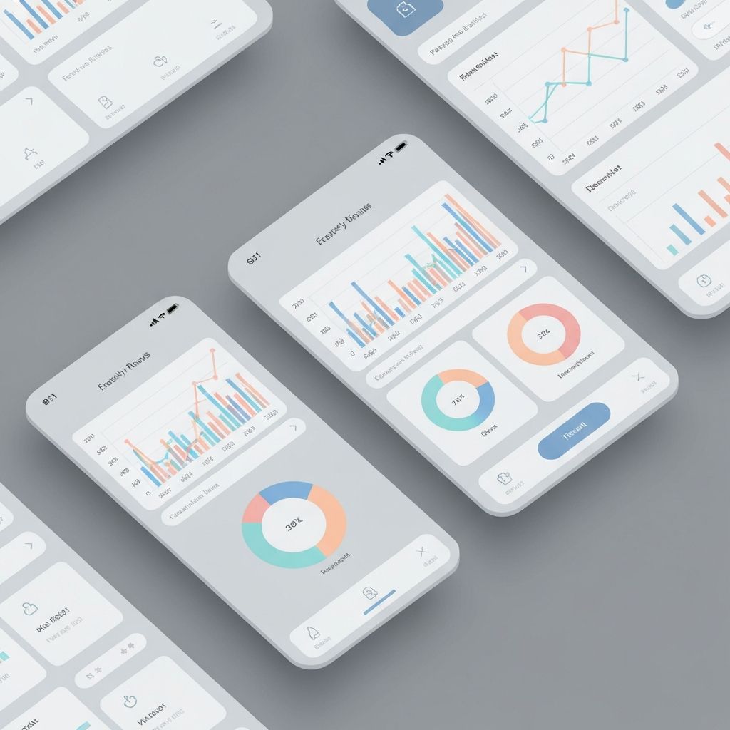
A data-rich yet calm health dashboard that lets users understand their metrics without overwhelming them.
- Client
- Meridian Health
- Role
- Senior Product Designer
- Year
- 2024
- Timeline
- 5 months
Overview / Challenge
Meridian Health wanted to give patients access to their health data — without burying them in clinical numbers. The challenge: present complex metrics in a way that reassures rather than alarms.
Discovery
Data that reassures instead of alarms
Interviews with 18 patients made it clear: raw numbers without context create anxiety. People want to know whether a value is “good” — not just how high it is.
We defined a principle of “calm data visualization”: context before precision, trend before snapshot, plain language before jargon.
System
A design system for trust
I built a scalable design system with a restrained color palette and clear state indicators. Every metric card follows the same pattern: value, trend, interpretation.
Charts were deliberately desaturated and given generous whitespace so the data can breathe — instead of overwhelming.
Impact
+41%
Weekly active users
−52%
Support tickets about values
Results / Impact
Measurable impact
+41%
Weekly active users
−52%
Support tickets about metrics
4.8/5
App Store rating
12
Reusable chart components
“For the first time our users truly understand their values. The dashboard removes complexity without hiding anything.”
Dr. Marco Weiß, Clinical Lead, Meridian Health
Contact
Let’s build something considered.
Whether a concrete project or just a hello — I’m always open to a conversation.